Rock On! (comments)
Displaying 1 - 11 of 11 comments

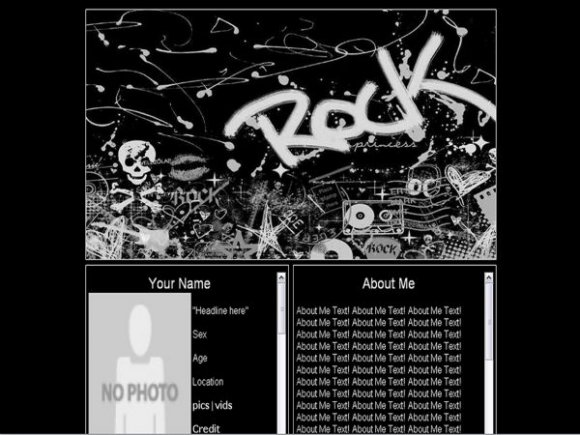
you have to find this.
"http://cbimg6.com/lay outs/07/08/28/21060aa.jpg"
a nd then replace it with a link to a new image.
you can get the link by uploading an image to either tinypic or photobucket.
and then it will give you the link to the image.

Im not entirely sure how to take out their pic and add mine.

this one is awesome and it fits me cause i ROCK! oh and you ROCK too for making it! ")

can anyone tell me what a friend ID is?
oh and this layouts sweet and idk what any of those dudes up there^^ are talkin about hha

I love this layout and have a decent amount of html experience so everything is working fine except that i cant figure out how to get the codes for falling objects, cursors and rollover effects to work with this layout....any suggestions?


i like the banner. the layout isn't centered in FF though

Hey, i got everything to work but the Picture *or the default* how do you change it?

Wow. First entry - AWESOME =]
Problems *me and my opinions =]*:
The Navigation. I don't like how it scrolls =] It's like a challenge to click one, hahaha, well, it's not, but still, I don't like that =]
The headers (interests etc...): I think you should space them out more from the rest of the text =]
and last of all
There's something white in the background behind the about me and the interests part, it's annoying me, lol! What is it?
=]
But like I said, it's your first layout! and it's good for a first =]
The Banner is awesome!!
And the layout is centered =D goood =]
I can't center my layouts =] Not enough knowhow of HTML. Lol! Self-taught :booo:
Keep posting layouts =D I want to see more from you =]

Nice banner. It looks a little stretched though. Also, I'd suggest using a smaller font. This is great for a first entry though :D
Add Comment
You must be logged in to comment
Layout Details
| Designer |
DeafeningSilence
|
| Submitted on | Aug 28, 2007 |
| Page views | 36488 |
| Favorites | 185 |
| Comments | 11 |
| Reviewer |
alovesopure
|
| Approved on | Aug 28, 2007 |