Elegant Tragedy (Div Overlay) (comments)
Displaying 21 - 22 of 22 comments

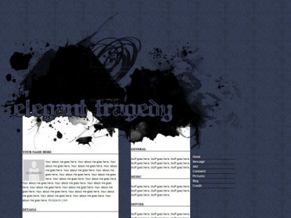
I've found your previous layouts to be a bit too simple, relying too heavily on the use of brushes but this one, while working the same formula, has come out a lot better.
The colour scheme is sleek and simple and goes very well with your title, though I think it would be better if the theme itself manifested, and reflected, more of the title. Good font choice by the way.
I like two column layouts, they usually come out quite well and this is no exception, although it is ruined slightly by the fact it scrolls for so much. And also, the left column ends with the page, which is a personal hate of mine because it always feels like there's more that hasn't loaded.
I might be good if you used some brushes, or added some sort of detail to the lower end of the columns if you're going to have them scroll so much, if only because it gets a little bland after a while.
But I love love your navigation, very cool and very well done.

I love this. It's simple but nicely done. I think you're on your way to being one of my favorite designers on here. :D
Add Comment
You must be logged in to comment
Layout Details
| Designer |
melancholiclights
|
| Submitted on | Aug 26, 2007 |
| Page views | 38704 |
| Favorites | 223 |
| Comments | 22 |
| Reviewer |
brownsugar
|
| Approved on | Aug 27, 2007 |