Zune (Black) (comments)
Displaying 1 - 15 of 15 comments

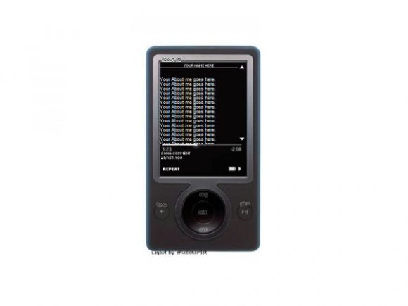
I would, but I'm resentful for zune for making a zune design. Makes my old model look awful. D:


I like the way you used the buttons to put "pics" etc. Awesome.


i love this layout very much..but when i put it on my page it doesent show..it only show a blank black space.how do i fix it?i would really love to use it:)


this layout definitely expands you're portfolio. i think u did a fine job. i like this a lot.

wow this is so cute. the simplicity makes it even more cute.

needs to be centered, nice layout but missing a few tweeks.

WOOOOW, This is very good :) PROPS! - LOL :)
Loving the Navi toooo :)
This idea has been completely over done. I know that doesn't mean it can't be reinvented but other designers have done this better. Your background is way too plain, it just looks odd.
And while I like how clean your image is, its placement is off center in FF, and the content area is just too small.
You can go further with this.


Add Comment
You must be logged in to comment
Layout Details
| Designer |
melancholiclights
|
| Submitted on | Aug 26, 2007 |
| Page views | 37593 |
| Favorites | 134 |
| Comments | 15 |
| Reviewer |
brownsugar
|
| Approved on | Aug 27, 2007 |