SuperBad (comments)
Displaying 1 - 13 of 13 comments

I agree with joespace, but this is a nice concept. the best movie of the year so far!

Very nice... haha thats the part when they are watching porn =P

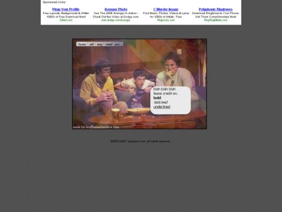
i'm a fan of minimal layouts, though i rarely use them. i like that you captured an image from the movie and used it as the backdrop for the "about me" section instead of covering the entire screen with "superbad" images.


i know guys, sorry.. i just needed a break from difficult divs due to school


I actually like the simplness of this. My only suggestion would be is change the background color to a warmer color or a pattern :D

I looked at the rest of the layouts you submitted and you're capable of some pretty freaking cool stuff so I just don't get this!
That content box is miniscule, and the box itself just looks completely out of place with the techi-colour of the backdrop - which is pretty cool - but the navigation is weird and overall, it just doesn't look good. Am I just looking at something completely different to you?

Add Comment
You must be logged in to comment
Layout Details
| Designer |
smashin
|
| Submitted on | Aug 26, 2007 |
| Page views | 13627 |
| Favorites | 36 |
| Comments | 13 |
| Reviewer |
alovesopure
|
| Approved on | Aug 27, 2007 |