Designer's Comments
Look carefully for specific instructions
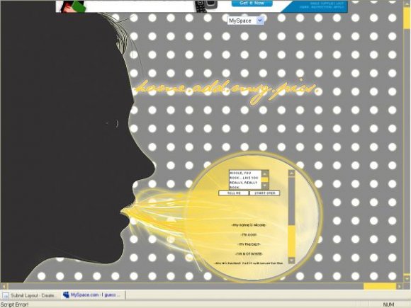
Using This Layout
For specific instructions read designer's comments
- This is a div overlay layout, html knowledge required!
- 1. Log into myspace.com
- 2. Click on Edit Profile (Profile 1.0)
- 3. Copy (ctrl c) and paste (ctrl v) code to the specified fields
Layout Comments
Showing latest 10 of 14 comments

I dont like the dots but otherwise its amazing! My friend has a song named 'blow me away'. haha.

awesome idea. but it is a little messy. i love the concept though.

looks like someone is vommiting

i agree with just about everything that flaymzofice said. i don't like the horizontal scroll, the content in the inside becomes very unorganized that way.
and i also agree that the polka dots in the backround don't quite flow with the rest of the design, i might suggest a little more of a vintage pattern? idk.
and the navi does look a bit forced upon, a little out of place, though i'm sorry i can't give much advice as to where else to put it.
great concept though(:

the navigation seems out of place, but other than that, great job.

this is really cool

this is cool. it made me laugh. i like where you put the navigation.

i ♥ it!
I dont know what they were talking about being boring i LOVE it.
=]

cool. (:
Hell yes. The concept behind this is amazing; completely original as far as I've seen, and great execution on the idea front.
I'm not a fan of horizontal scrolls though, very inefficient as far as content is concerned.
And I wish you'd done more with the background. I couldn't suggset what, but beyond the vexel (?) and the content backdrop, it just seems a little empty. And the navigation isn't very fun; it's like it's there because it has to be.
Think you could take this further but good job so far.
Layout Details
| Designer |
Nikki09815
|
| Submitted on | Aug 26, 2007 |
| Page views | 23,302 |
| Favorites | 155 |
| Comments | 14 |
| Reviewer |
themarkster
|
| Approved on | Aug 26, 2007 |