pirates arrrr cool. (comments)
Displaying 1 - 15 of 15 comments


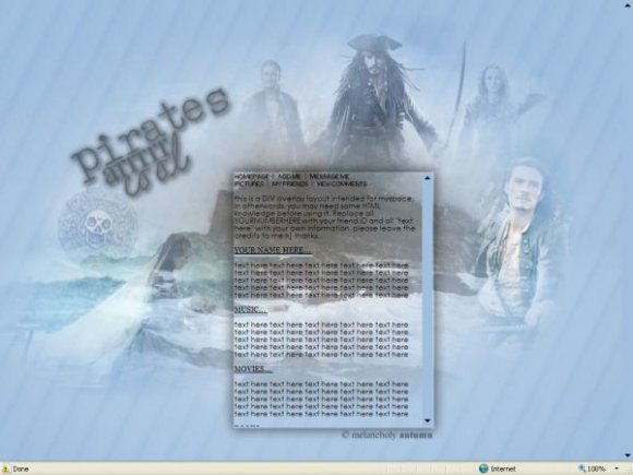
i like the banner.. but the content section seems too big and like it has too many words in it.

I love Pirates of the Caribbean, but this would be better if there were less of Orlando Bloom(no offense)

Love it. I might agree on the navigation, though. (I'm back! ^^)

i like the background, i'm not fond of the navigation, though


the image quality could have been better, i mean some of the places especially your credit is really blurry.

love the images. i dont really like the way the titles [about me, music etc..] fit because it looks so techie and pirates are more rustic feeling you know... and i had another comment but i forgot lol but beautiful work on the image [bg] :)

i love this layout...but im having a few problems with it...I didn't take out the credit but it's not there, also there is no submit button for the comment box when I use it...hmm


Add Comment
You must be logged in to comment
Layout Details
| Designer |
melancholyautumn
|
| Submitted on | Aug 25, 2007 |
| Page views | 10525 |
| Favorites | 63 |
| Comments | 15 |
| Reviewer |
Clashing
|
| Approved on | Aug 25, 2007 |