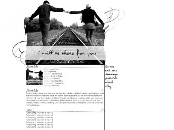
I Will Be There For You... (comments)
Displaying 61 - 78 of 78 comments

I Love this layout!
seriously one of the best i ahve ever used!


thanks for the feedback everyone... sarah just recopy the code :] if that still doesn't work... PM me
it doens't work. like i do EVERYTHING but all that shows is white backround and just some black lines =/ what's wrong with it??

I love the layout! I think it's simple but in a good way =D The only thing that bugs me is where the nav is... It looks like its just sticking out
psh i love this layout! and i love the b&w and simpleness of it! perfect!

ohhh very nice :) i like your nav [mine dont come out that cool :'( lol ;)] i like :)


this is realy nice, one of my favorites from you.

I think this one follows suit with your other ones :) The swirls are a little out of place though, but I love the footer :) It's a nice finishing touch... Great as usual :)


I Love It! I Especially Like The Black-And-White.....Im Just A Big Fan Of Black-And-White Stuff....

The layout looks okay. It just seems a little too simple for me. I think you could've chosen a much better font for the header image and the navigation. But the reason the layout looks overly simple to me is that you only erased the edges of the base image, though creatively, and only added a couple brushes on the sides of it. On the bright side, I love how the nav hovers. :]
beautiful. this layout is awesome. =D it would've looked better in color, tho. nice navigation. the coding is perfect.
Add Comment
You must be logged in to comment