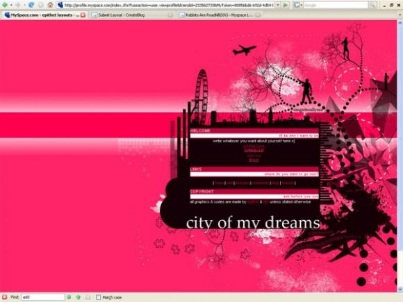
city of my dreams (comments)
Displaying 1 - 20 of 23 comments


its ok i like the original better tho.
and since im from england, its kinda like.. hmm lmao
it intrigued me tho,
yeah pink isnt my fave color either lol but its nice
the busyness makes you wanna look at it.

I serisouly love it. Pink isn't my favorite color though and there's so much of it. I would totally use it if it were like...blue.
Good work! Keep it up.

As for the blurry I agree but it's very good, love how chaotic it is :) Great job!

I agree with Relentless. The brushes are a little too much. But great as a start. :D
Btw, Sang, would making it as a maximum-quality JPEG work, instead of PNG?


I'm glad that I inspired you but I didn't think it would be like the whole concept including the background.
However, I think the content is kind of small. You should have put it on .png since some of the parts look blurry as a.jpg. It's good for you're first but don't overdue the brushes, it sometimes make it look messy and busy.

one of relentless's layouts was an inspiration of this layout... if he has a problem with it, i dont mind taking it down. it was my first layout, sadly i should have saved the image as png so the quality would have been better...
thanks so much for your comments XD


really cool i was thinkiing ondoing a layout aling to the right nice
1 thing the main img is over the google add
but the rest is awsome

This is a very cute layout. I'm not a huge fan of pink, but pink & black looks great together. It reminds me a lot of Relentless's work, though. (Which isn't an insult, I love it, but the artist might feel differently) The content boxes may be a bit small, but the layouts good overall.


You've done great with this layout. I love how the background is and I'm huge fan of pink. ^^:
Woah, this is really PINK, LOL.
I like the sharp contrast of the predominant colours, black and pink almost always go well together. Especially this shade of pink.
I love the use of brushes in the background, but I don't think it has much bearing on the concept, which is a shame.
I like the backdrop for the content area, it looks really cool, especially that big ole London Eye? Or ferris wheel, LOL, whatever it is, I like the detail on it being made all black.
I think the content area itself is too small - obviously it'll scroll? But I think the scrolling area is too small, especially if people like big blurbs about themselves. And also since you don't have other interest areas.

i agree on it being bright... and some of the brushes used are blurry
also the links are a tad weird... outside of that it looks busy but in a good way

Add Comment
You must be logged in to comment