Designer's Comments
Look carefully for specific instructions
Make sure you change this or your links will NOT work.
Please do not remove the credit section within this layout.
Do not edit anything else beside the welcome section and the links. You may add more sections if you wish, but please do not change the css/div code.
Using This Layout
For specific instructions read designer's comments
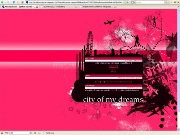
- This is a div overlay layout, html knowledge required!
- 1. Log into myspace.com
- 2. Click on Edit Profile (Profile 1.0)
- 3. Copy (ctrl c) and paste (ctrl v) code to the specified fields
Layout Comments
Showing latest 10 of 23 comments

I love it. I think I'll try it out.

wow. *tear*
its ok i like the original better tho.
and since im from england, its kinda like.. hmm lmao
it intrigued me tho,
yeah pink isnt my fave color either lol but its nice
the busyness makes you wanna look at it.

I serisouly love it. Pink isn't my favorite color though and there's so much of it. I would totally use it if it were like...blue.
Good work! Keep it up.

As for the blurry I agree but it's very good, love how chaotic it is :) Great job!

I agree with Relentless. The brushes are a little too much. But great as a start. :D
Btw, Sang, would making it as a maximum-quality JPEG work, instead of PNG?

nice layout

I'm glad that I inspired you but I didn't think it would be like the whole concept including the background.
However, I think the content is kind of small. You should have put it on .png since some of the parts look blurry as a.jpg. It's good for you're first but don't overdue the brushes, it sometimes make it look messy and busy.

one of relentless's layouts was an inspiration of this layout... if he has a problem with it, i dont mind taking it down. it was my first layout, sadly i should have saved the image as png so the quality would have been better...
thanks so much for your comments XD
It's so pretty. I like the brightness.