Summer's End (comments)
Displaying 41 - 52 of 52 comments

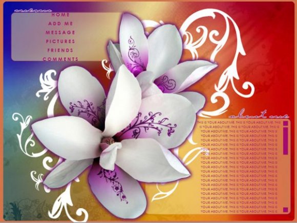
I love the image but the navigation is spaced too far apart

Thanks everyone for your ever-so-valuable input. I really do appreciate it. This layout was a bit more smple than I usually like, but sometimes i think simplicity is the way to be appreciated. Thanks for the comment on the flower, i made it from a picture of a n actual flower and addeed purples to it. About the orange, yes the original design was supposed to have a white or neutral background, but i encountered a problem with my matching scrollbar on the "about me" section. It just didn't seem right to me. So I had to match it with the background of the initial box. Also, about the minimalism or if you so choose "lack" of navigation links, feel free to add your links. I, being not too into blogs and too many links, found it not a need, but if you wish, alter ahead. I'm really sorry about the FF deal. I don't have FF so i can't fix it, but if you want to move the boxes, again, feel free. I hope i addressed all your queasions, and thanks for all the love.


I'm not really a fan of the flower but other wise real nice =]

the colors are very nice and the flower image is striking.
I agree with Mike - you could have done a lot more with the navigation and it does let the layout down a bit (and also in FF, the navigation itself doesn't fit inside the allocated space).
However, the rest of the layout is good - very graphic based but good nonetheless; not too cluttered as it could be - good restraint on the content, though people who like lots of content won't want to use this layout.
I like how the centre piece is so obivously the flower but it's still not really the first thing you see, it's like you see the whole layout. Not sure how you did that, but good job.

you are AMAZING! i LOVE this layout hardcore!! keep up the good work! you've got 2 for 2 in my faves!!

the navigation is really boring, but i like the colors you used

Oooo, really pretty. I'm not a big fan of the orange background but it's still very nice :D
Add Comment
You must be logged in to comment
Layout Details
| Designer |
ill_lil_girl
|
| Submitted on | Aug 21, 2007 |
| Page views | 84491 |
| Favorites | 876 |
| Comments | 52 |
| Reviewer |
IVIike
|
| Approved on | Aug 22, 2007 |