Designer's Comments
Look carefully for specific instructions
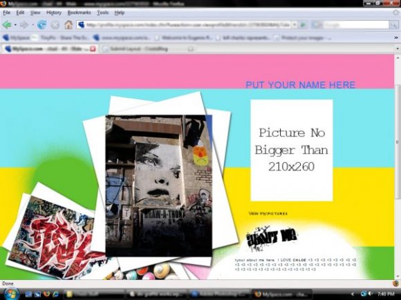
okay so this layout was made by me and only me so dont jock/steal this layout. okay so this is what you have to do:
1. change the "XXXXXXX" to your friend ID
2. change the "PUT YOUR NAME HERE" to your name
3. change the "your about me here" to what you want your about me to be
4. last change the "no bigger than picture" to a picture of you and resize it so its no bigger than 210x260 and upload it in tinypic and put the code in the display picture area
IF YOU NEED HELP OR HAVE ANY QUESTIONS PLEASE FEEL FREE TO COMMENT ME.
CHAD DEVIL
ENJOY
Layout Copyright:
East Coast Designs & Co.
Using This Layout
For specific instructions read designer's comments
- This is a div overlay layout, html knowledge required!
- 1. Log into myspace.com
- 2. Click on Edit Profile (Profile 1.0)
- 3. Copy (ctrl c) and paste (ctrl v) code to the specified fields
Layout Comments
Showing latest 10 of 16 comments

shits crack.
can we put music on here??
write back to help thanks
amandra

i love this one chad
i love it!!!
man iy doesnt work for me :( it either just shows up in my about me or in my i'd like to meet... its not an overall page... help

on aol the images one hot mess with a ugly black outline... outside of that i agree with some above, on the copyright, the quality,
also you could have picked a better background... the rainbow doesn't seem to fit the layout's theme

It looks great, just wanted to let you know that you spelled view wrong :D

pretty good, except i think that it would be better if the lines weren't so big in the backround or use like more splatters instead

this is really nice. i love the daring art of graffiti...i think the navigation could've been bigger and you probably could've incorporated the graffiti theme in the navigation as well
Good theme. But I think the picture of the face layered on top of the white ones is needing for a little touchup: the top right corner appears blue and the pictures it's on are a little plain. Good job overall, though.