Roses (comments)
Displaying 1 - 15 of 15 comments

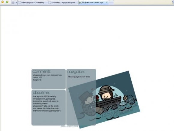
Cute, I like the setup, but this really needs a background color or pattern.
my friend has this profile!!i love it...it's simple but cute..

im just having a great deal of trouble with the comment box. can someone help me?
i love where the image is placed. it's unique, & i can read what the image says clearly.
well i happen to love where the image is.
and what font was used for the headings?

O [H] M [Y] G [ot] i love this super simple and yet kute love it :D
to Nye100273; i was going to paste the links from the stuff, but tom edits it and changes the links and make it all messy, and i didn't like that. you should know basic html [ie; links] anyways.
This is cute, but I understand the comment box but not the links. I mean I will just copy the links from another layout, I just wished taht you would have done it like the other layouts.


I think it's kinda weird how the image and the content area overlap...
Maybe if you stuck the banner on top?

this is very very simple, and i truly luv it. it's hard to read the quote on the image though.


mm.. cute.. I like the rounded border rectangles for the content, but I really don't think its a good place for the background image.. it's too cute to be out of place
Add Comment
You must be logged in to comment