Designer's Comments
Look carefully for specific instructions
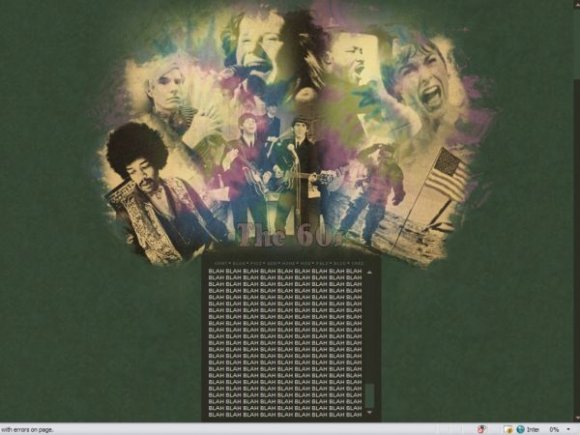
This layout was a request. I held a contest for one and the person who won asked for a sixties layout. It took me FOREVER to make this layout look decent. And I still don't think it looks that great. D: I tried though.
My new website!: website
Myspace: myspace
Using This Layout
For specific instructions read designer's comments
- This is a div overlay layout, html knowledge required!
- 1. Log into myspace.com
- 2. Click on Edit Profile (Profile 1.0)
- 3. Copy (ctrl c) and paste (ctrl v) code to the specified fields
Layout Comments
Showing latest 10 of 16 comments

wonderfulllll ♥

Thanks guys. :)

awesome! :)

fabulous.

I really love this... kind of only because of Andy Warhol though. The graphics are wonderful and I like the colours, but I think I'd like it more if it were just a Warhol layout. *hint: I'd love you immensely if you made an Andy Warhol layout* >.>
I do like how well all the pictures are blended. =]

pretty bad ass layout, you should make a 50s layout with cash, Elvis, jerry lee lewis, etc
or 70s layout with grease... no idea what else came out in the 70's lol
anyway its an awesome layout, love the colors and the patterns used for the layout.

I love this one more than the "80s" theme. Sweet colors... it gives a little 60s feel. =]
I Really love this one.
Wicked Job.
But I agree with SoEffinMajor
I like to put my music playlists in there and I can never fit them.
Thanks everyone. :D

so cool...i just wish there were more sections to separate what i write