Unwanted (comments)
Displaying 1 - 20 of 28 comments


thanks mark... i made this one ina about 30 mins so it was pretty quick XD

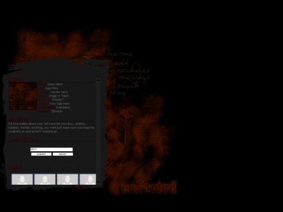
Layout looks a little too dark, though I know that was what you were aiming for with the theme being "Unwanted." I think you could've done a much better job. But I like how you blended an image of a girl on the side, and the "final lap" font for "Unwanted" looks good with the layout too.

Hmm, I don't know if this is too dark; I quite like it. Especially when I looked closer and realised you're ever so subtly used that image of that girl. That's textbook blending - phenomenal job.
I like the graphic element the body content sits on; gives it character.
I think the choice of colours was great - gives it a very tragic sad kind of dark feel (as opposed to twisted dark).
My only complaint is that it resembles the style I would normally earmark Amanda for in terms of content layout? I liked your definitive style. But other than that, I like this.


not your best, and the grey background looks weird next to the orange/red brushes
had it been much darker it would flow better


this is dark and gloomy, but i think it goes with the theme.

If you made the red you used just a liiiitle bit brighter, it would be perfect. :)

Yeah like everyone said, it's a little too dark. But it's nicely done.

Add Comment
You must be logged in to comment
Layout Details
| Designer |
IVIike
|
| Submitted on | Aug 19, 2007 |
| Page views | 44643 |
| Favorites | 145 |
| Comments | 28 |
| Reviewer |
moorepocket
|
| Approved on | Aug 19, 2007 |