Designer's Comments
Look carefully for specific instructions
Paste Codes In Correct areas
Replace all the XXXXXX with your friend id
replace all friendurlhere with your friends urls
Replace Default Image links With Your Own Image Links
Discription:
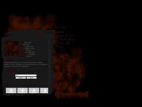
This is a Div Overlay in order to use this layout make sure you are good at HTML and know how to read it. This layout is dark... really dark :D anyway it's not really my style, but i hope you all will like it :]
Notice
DO NOT STEAL MY CODES! I will just stop contributing if it doesn't stop
The layout was tested in IE and Firefox
Resource Credits:
http://myspace.com/the_ecc
Insurmountable - Comment Box
Layout Copyright:
IVIike | East Coast Co. | xInfiniti
Using This Layout
For specific instructions read designer's comments
- This is a div overlay layout, html knowledge required!
- 1. Log into myspace.com
- 2. Click on Edit Profile (Profile 1.0)
- 3. Copy (ctrl c) and paste (ctrl v) code to the specified fields
Layout Comments
Showing latest 10 of 28 comments

thanks

ooo it's soooo dark
thanks :]

Its nice and dark.
thanks mark... i made this one ina about 30 mins so it was pretty quick XD

Layout looks a little too dark, though I know that was what you were aiming for with the theme being "Unwanted." I think you could've done a much better job. But I like how you blended an image of a girl on the side, and the "final lap" font for "Unwanted" looks good with the layout too.
thank you :]
Hmm, I don't know if this is too dark; I quite like it. Especially when I looked closer and realised you're ever so subtly used that image of that girl. That's textbook blending - phenomenal job.
I like the graphic element the body content sits on; gives it character.
I think the choice of colours was great - gives it a very tragic sad kind of dark feel (as opposed to twisted dark).
My only complaint is that it resembles the style I would normally earmark Amanda for in terms of content layout? I liked your definitive style. But other than that, I like this.

little dark but looks real cool love it ^^
thank you
Layout Details
| Designer |
IVIike
|
| Submitted on | Aug 19, 2007 |
| Page views | 44,640 |
| Favorites | 145 |
| Comments | 28 |
| Reviewer |
moorepocket
|
| Approved on | Aug 19, 2007 |