Keroppi Lay---Nice and Simple (comments)
Displaying 1 - 15 of 15 comments

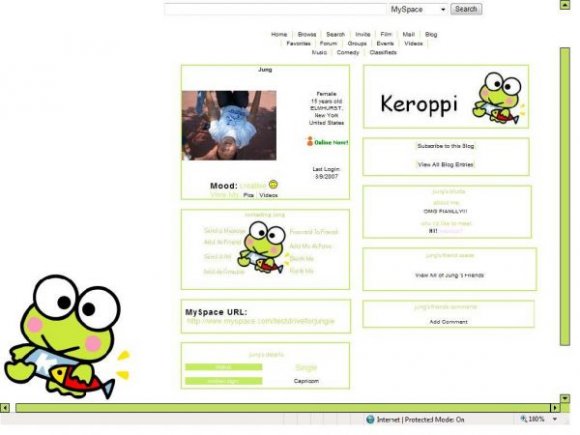
cute picture and colors.. maybe you couldve used a different image instead of the same one 3 times.


I've always love Keroppi sooooooooo much! From the day I met it- which is about 19 years ago- until now! Ok, let's just drop this topic here :D Thank you for this great layout!

OMG! Haven't seen this character like forever! I difinitely love this layout!! cute, cute!

its cute but the font is sorta blurry...on the contact table. i love how nice and simple it is though :)


SO SORRY! i wuz like all physced of tryin to get to the contact table thingie so i rushed wit al the fonts and colors, im thinkin of makin a better version :P

i agree with the markster :)
and i really like the simple-ness of it.

it's cute, and u only need to putit in the about me! also it shows ur picture and everything. thatnk u for putting this on! =)

The quality of the background image is awesome! Very clear. I like the simplicity of this layout as well. However, the text looks too bright and hard to read. Also, I think you could've chosen a different font for the banner, instead of using Comic Sans. (Just my picky opinion.) Another thing that might make this layout better is the use of different images for Keroppi. Good job though. :]
Add Comment
You must be logged in to comment
Layout Details
| Designer |
bookieworm546
|
| Submitted on | Aug 9, 2007 |
| Page views | 54318 |
| Favorites | 237 |
| Comments | 15 |
| Reviewer |
themarkster
|
| Approved on | Aug 9, 2007 |