Dream Box (comments)
Displaying 1 - 19 of 19 comments

I just wanted to change the header..unstead of having "extra" I want "Life" and it wont let me change that. So how do I do that?


i love this layout. but i was wondering how i hide my music. its smack dab in the middle of the layout.
i wanna hide my song is this possible?
oh and what about a blog button?
i love this layout, but is there anyway that a button to click for blogs can be added?
I really wnat this on my page so can you help me..... myspace.com/twurk_dat_work_dat 69
I really wnat this for my page but eveytime i put it on there nothing comes up but a blue background. I like so need your help

i love this one.
every other one i tried didnt work right.
this one actully worked perfect!!
keep up the good work and make some more
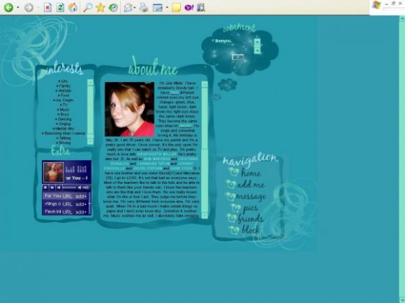
it would look really good if the images were higher in quality.

cute but the nav does look uber low on quality
and isn't this way too high?! wouldn't the myspace ad overlap all that when used on myspace???

The layout is good, but the navigation was very blurry and hard to read. Everything else was nice though.

The layout looks a little blurry and pixelated in some areas. Also, I think it would be better if you moved the whole layout down a bit, since the top part is where the advertisement is.

Cute. But yeah like everyone said, the nav has weird quality.

This is cute but I'm not so sure about the pictures in the navigation... I think the navigation would have been better with rollovers :)

i agree with luku...the navigation is pixelated in comparison to the other boxes

Add Comment
You must be logged in to comment
Layout Details
| Designer |
lisa-marie-09
|
| Submitted on | Aug 9, 2007 |
| Page views | 32562 |
| Favorites | 264 |
| Comments | 19 |
| Reviewer |
Alvin
|
| Approved on | Aug 9, 2007 |