Vintage Ruby (comments)
Displaying 1 - 17 of 17 comments

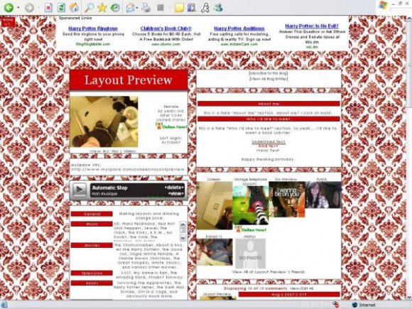
I like the background but isn't Vintage background layouts supposed to get rejected? Could have sworn that was in the guidelines
Posted by dilligrout on Oct 15, 08 6:54 pm


I LOVE this layout.
Is there a way I can make it so my comments aren't so narrow?
Posted by jfish3d on Apr 8, 08 9:25 pm

nice, but how do you get the extended network back on the page?
Posted by losercool on Aug 14, 07 3:16 am


this is an all-around good layout, but i especially love the name text.
Posted by stumphart on Aug 9, 07 2:46 pm


this is nice, but the background is a little too busy for me.
Posted by jesusisthebestthing on Aug 7, 07 11:04 pm


I like the background pattern, although it looks just a bit too hard on the eyes. I also like how the name text is set up.
Posted by markmejia on Aug 7, 07 10:47 pm


i think it looks good, if anything, i would make the red that backgrounds the headers a little darker
Posted by brooklyneast05 on Aug 7, 07 10:06 pm

Page 1 of 1
Add Comment
You must be logged in to comment
Layout Details
| Designer |
CrotchetTheLeper
|
| Submitted on | Aug 7, 2007 |
| Page views | 45545 |
| Favorites | 201 |
| Comments | 17 |
| Reviewer |
Alvin
|
| Approved on | Aug 7, 2007 |