Teddy, you're the one. (comments)
Displaying 21 - 27 of 27 comments

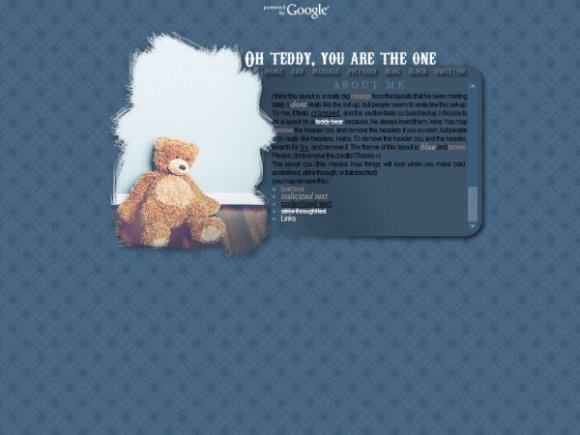
I like this one... it's cute. It's always good to be flexible with your style, I think you did a great job on the teddy bear image.
Posted by FoxLucky on Aug 7, 07 5:34 pm


I like this one; the simplicity of it looks pretty tidy. The scratched-out look of the teddy bear picture looks great, but I just think there shouldn't be a drop shadow for it. I also love that you used Arial Narrow, but it'd look better in white rather than black. The font for the title and nav is overdone to me, but the way you used it looks very nice. Good job. :]
Posted by markmejia on Aug 7, 07 4:18 pm


« Prev ·
Page 2 of 2
Add Comment
You must be logged in to comment