Floral Flow (comments)
Displaying 1 - 20 of 21 comments


Id love to use this layout on myspace. However I am very green on the html/css.

Below me, you're going to need to update your browser. If it cannot read transparent images, it most likely out of date :)
Very nice layout, but when I view the layout in CB Mode, the images for the navigation are blue in the background. I like this layout and the font, very creative. (:

i will be using this. i luv everything about it...very clean...my favorite from you so far

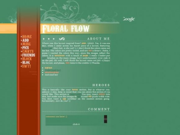
I love the font :) It looks really good with this layout... It does remind me of "FreeFlow"... I don't see the similarity to Fainaru though. ^_^ Great job as usual.
thanks alvin! Everyone keeps saying that font is overused. But I dont think so! =)

Angeline, I really like this! The colors are really pretty. I LOVE the font you used for "Floral Flow".
Haha. I think it has to do with the set up possibly? Yeah, I need to lower the main div image down 90pixels. But, I've tried that, and the bg repeatation appears. I've tried blending it, so the bg doesnt not appear so bad, but it comes out looking horribly =/

i agree with the markster on it looking too much like fainaru's style of layouts, but i think you might want to lower it a bit, wouldn't the ad block most of the brushes on top? it looks really nice. and is this layout still inspired from peter?
u left the same about me text from your last layout.

this looks really good. i agree with everything themarkster said. great work :)


I really like this one. It looks clean and tidy; it kinda reminds me of Fainaru's layouts. :D Anyway, I think you could've chose a different font for both the title and the nav .. maybe a basic, professional font, like Lane or Walkway or something. It's all good though. And I'm glad the nav hovers, it looks pretty cool. I love the content area. The serif font looks great on it, and the dividers make it looks even more professional. :]

Add Comment
You must be logged in to comment