Insurmountable (comments)
Displaying 41 - 60 of 60 comments


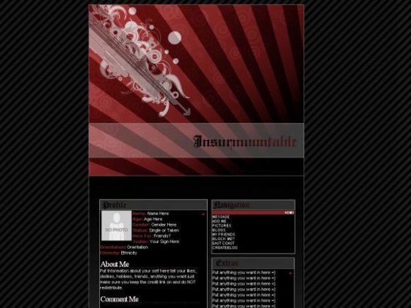
nice but the font for "insurmountable" doesn't look all that great
and why is there such a great space between profile, nav to the top header pic?
but the header looks nice just take out the white banner


oh, wow! this is so awesome...i really like this. great job

mark- i noticed that too, but i didn't feel like fixing it. as too the stripes i don't know why i'm still working on them :D

this is really nice :)
i like the header graphic
and the way you set it up reminds me of a xanga lyt :)

Looks pretty tidy. It just bugs me how there's a big gap between the header image and the content area. Also, the background stripes look a little too noticeable. Good job, though. :]


I agree with S&S
LOL It kinded reminded me of Target after a minute with all the circles in circles... I really love the colors on this one! Great Job! ^_^


This is clean! The banner looks really good, I love the beams that are coming out. Nice work Mike!


Woah, great job on this! I really like the feel of the layout. :)
Add Comment
You must be logged in to comment