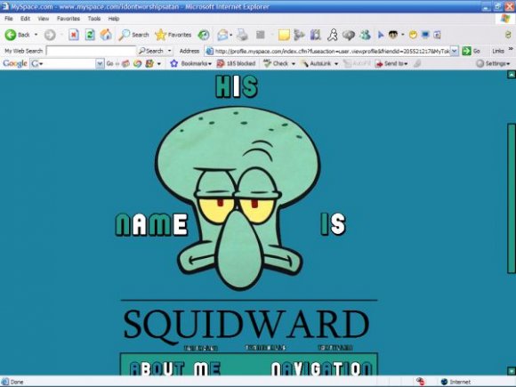
His name is Squidward (comments)
Displaying 1 - 16 of 16 comments

i like the header
the bottom kinda
looks weird like
its just pasted
on there or
sumthing? idk
i love this layout!!!!!
but ya know what would make it even cooler?
a comment box.
but ill just add one and pray it doesnt screw everything up


i love squidward...i would use this layout, but it really isnt all that great.

thank you people for commenting
i don't care much for the link color either, or the font for "Squidward"
i'm glad people like the icon, i found it on photobucket and figured it would be great

lol, the icon was a cute touch, but its about time some one does a squidward layout =)

i hate the fonts, but the rest of the layout is pretty cool. I like the avatar you used at the bottom :D

I like how it's really good quality. But I think the link color should be a different color.

xD I love that episode. (The one with "tentacles, tennis balls, and tortellini" But yes, it could be improved in a few areas.

this is much better than the other layouts you have uploaded, and the green and blue look really good together.
sure, it has some things that could be improved, but overall i think it looks ok. you're definitely getting better. :)
i agree. and also you should have made the navigation smaller because there is all that space right there. Good job though.

im not a fan of the font choices, but i think the "his name is" should have just been one straight line across the top instead of putting the word to the side of him, it makes it off balance feeling.
Add Comment
You must be logged in to comment
Layout Details
| Designer |
coldplayisawesome
|
| Submitted on | Aug 4, 2007 |
| Page views | 30153 |
| Favorites | 115 |
| Comments | 16 |
| Reviewer |
karmakiller
|
| Approved on | Aug 4, 2007 |