Designer's Comments
Look carefully for specific instructions
everything's simple.
don't take off the credit in the corner!
Using This Layout
For specific instructions read designer's comments
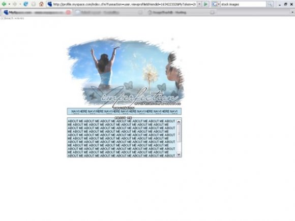
- This is a div overlay layout, html knowledge required!
- 1. Log into myspace.com
- 2. Click on Edit Profile (Profile 1.0)
- 3. Copy (ctrl c) and paste (ctrl v) code to the specified fields
Layout Comments
Showing latest 10 of 10 comments

silkscreen

hey hun what font did use for the header?
and i didnt insert the navigation
because of the msp links
haha. sorry guys
i was tired
and i didnt feel like redoing everything(;

I think it should've extended to the left as well. I love the font on the header; it goes with it prefectly, but the pixel fonts on the navigation and the about me doesn't look very good. :[

you could've done the navigation...why didn't u?

the font you used for navigation and the credit is hard to read and rough. But i love the header image :]

I agree with JC (brooklyneast05), the image definitely needs to extend more to the left.

love it

i think u would have been better off to go ahead and do the navigation, i think the image should have extended further on the left
Layout Details
| Designer |
moonfoxsr
|
| Submitted on | Aug 4, 2007 |
| Page views | 33,944 |
| Favorites | 118 |
| Comments | 10 |
| Reviewer |
karmakiller
|
| Approved on | Aug 4, 2007 |