Harry Potter and the OOTP (comments)
Displaying 1 - 20 of 31 comments


Absolutely LOVE the layout. I just can't friggin figure out how to upload my friends pictures and link it to the layout. I've tried looking at the tutorials, but all they did was confuse me. Anyone willing to help?

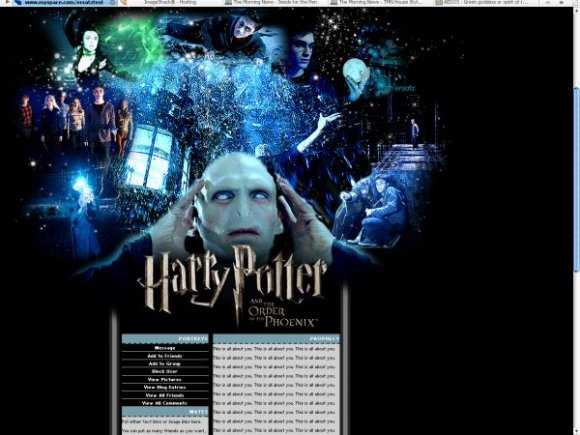
I love the Banner and Voldy's eyes are wicked awesome. Just somthing about the tables isnt sitting pretty with me.
=[

Hi there
i love this design but am struggling to use i on my myspace page - it keeps telling me "invalid Friend ID" when i try and click on the links, i have found my Friend ID but where do i input the numbers within the coding to make it work?

WOW This is awesome!!!!! Hahah, love what you got going on with the portkey and the owl etc.. :)
(Y)
This is a very good layout and I love the banner but the content area is way to long and I don't like how Voldermorts eyes are all like spazzed out.
The scrollbar could use some color and you should make the banner smaller so that side scrollbar goes away.

The scrollbar isn't colored because it would only show up colored in IE...and I like big layouts. I have a really big resolution so...I make them look good to me.

Beautiful! One of the best HP Layouts I've ever seen

it's a bit big, and the scrollbar isn't colored, but i think it looks cool.

this would be unbelievably amazing if i wasnt so disturbed by voldemort's eyes. nice job though :)

awesome layout, but i think you over did it with the stars. The blending of images need a bit of work, some look randomly placed while other blend well with the other images. the text headers were a cute add on although its font is a bit out there. also its pretty bad ass you put lord voldemort in the middle making him the main focus.
good job on banner but its too long veritcal wise- i like my layouts sweet, simple and spanky- NO SCROLLONG ON SIDEBARS TO SEE REST OF PAGE, KEEP SCROLLING WITHIN THE PAGE SECTIONS ONLY AND YOU'LL HAVE A 100% COOL LAYOUT :)- am lazy i hate to scroll down the page.
Add Comment
You must be logged in to comment