Sully I Need You (comments)
Displaying 1 - 20 of 22 comments


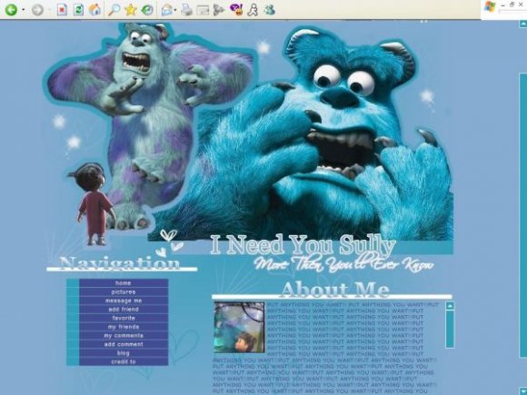
If You revize it and Border the tables i will use. No Doubt.


It's an awesome layout, one that I REALLY want to use, but you can still see some of the stuff underneath! fix it up, + ill use it for sure ;)
Hmm.. "/
-Well, I actually completely fell in love with it the first time I saw it, and I still love it.
Great Job!

good idea..cutouts could've been better though..next time..

I agree with the girl below me. You could have used borders for your tables to, that would have made it look neater.
Something about this is.. odd. The color blue you used is a weird color. And the outlines look so blurry. It looks like you took a brush and did them yourself.


Aw, that movie made me cry =[
The layout is so-so but I think it's cool that someone made a layout out of the movie.

This is a cute idea, but it's a bit rough. =/
I'm sure lots of Monsters Inc. fans will like it though. :)

I love the colors, but the structure could have been better. The stroke also looks bad... and the images don't quite match the quote. LOL I like graphic though, it would be great if you removed the quote, stroke, and rearranged the layout...

I think its nice, but you could have dont alot better =[ The outlining of the images are pretty bad quality, and are pretty blurry. Also, it would look much better if you blended the right corner of the image, it looks odd cut off. =)

It looks horrible to me. Sorry.
I'm not a big fan of stroking the extractions that you made. It doesn't look right. The scriptina font is horrible. The header "Navigation" and "About Me" could be better. Gradients on text doesn't look right with the layout. The brushes you used are ugly.
Otherwise, for a beginner, it looks okay.


Add Comment
You must be logged in to comment
Layout Details
| Designer |
pigface_designz
|
| Submitted on | Jul 31, 2007 |
| Page views | 24593 |
| Favorites | 171 |
| Comments | 22 |
| Reviewer |
brownsugar
|
| Approved on | Aug 1, 2007 |