Go Wild (comments)
Displaying 1 - 16 of 16 comments


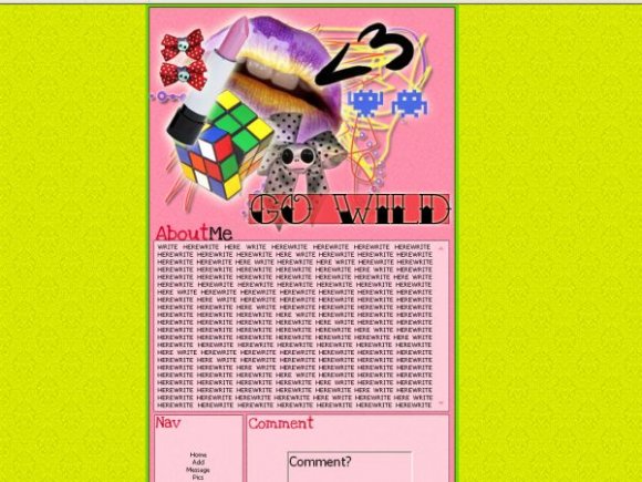
i think its juss a little plain but i really like it though!!! =]

i love its randomness.
i love the colors.
ESPECIALLY the yellow.
my advice, though, would be to alter the "comment" section--it's really big.
it looks as if you put a lot of your time into the graphics of the layout, and that's cool. however, the navigation is slightly in the shadow of everything else.
the "go wild" text is sort of.. out of theme; but it's not so apparent that it turns me off personally.
:D!

i inspired someone!!
haha, all the colors and images dont go for me.
i love victorian backgrounds though

dont agree with the small nav links in such a big box but the rest of it looks cool :)

I really like the layout, but the background colour doesn't match in my opinion.

the comment box is big, but i do like the yellow.


I agree with schizo, and that comment box is HUGE. while the navigation is soo small. also the go wild font looks soo weird since it has a western look and the layout is girly


i was going to say that!!! but yeah i think it's a bit too random and i don't like the font you used for the section headers :/

This reminds me too much of the layout jewellygirlx submitted a little while ago...
Add Comment
You must be logged in to comment
Layout Details
| Designer |
Fluid
|
| Submitted on | Jul 30, 2007 |
| Page views | 51891 |
| Favorites | 313 |
| Comments | 16 |
| Reviewer |
karmakiller
|
| Approved on | Jul 30, 2007 |