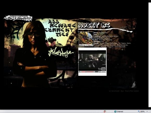
Designer's Comments
Look carefully for specific instructions
Using This Layout
For specific instructions read designer's comments
- This is a div overlay layout, html knowledge required!
- 1. Log into myspace.com
- 2. Click on Edit Profile (Profile 1.0)
- 3. Copy (ctrl c) and paste (ctrl v) code to the specified fields
Layout Comments
Showing latest 10 of 10 comments

i agree, the font isn't all that great but everything else is fine.
i hate the font, but the rest of the layout is really cool. Good Job
isnt it missing a home button?
the navigation is hard to read. it doesnt have enuff space for me 2 do my do. but i do like the dark look, i think the imagery is very nice. and overall, you seemed to accomplish what you set out to do.
Nice!
yeah the navigation not obvious enough but i still really like this and the game rocks too!!
I don't like the navigation, you should
remake it.
but the whole layout is nicek, the darkness
is awsome
i don't think the navigation is obvious enough. if it was more readable maybe
I like this layout, nowhere near as good as your others though. [=
It lacks.. space. For me anyway.
I love the dark scary look.
Layout Details
| Designer |
HalfBreed
|
| Submitted on | Jul 29, 2007 |
| Page views | 16,156 |
| Favorites | 25 |
| Comments | 10 |
| Reviewer |
brownsugar
|
| Approved on | Jul 29, 2007 |


