Stumpy. (comments)
Displaying 1 - 14 of 14 comments

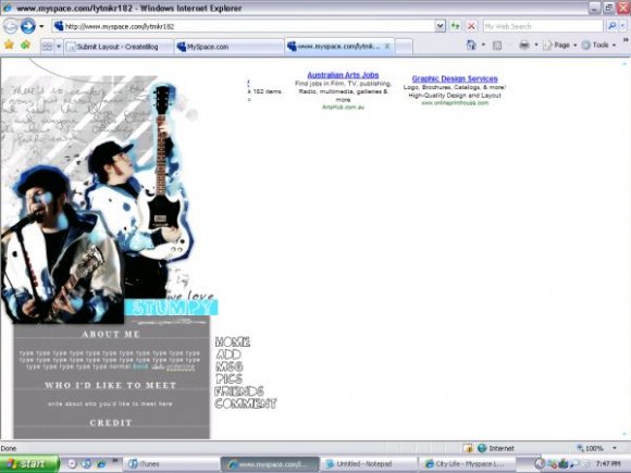
i agree with schizo, i'd love to see this with some other bands because the rollovers are awesome

both of your layouts are awesome! i love the colors, its nice to see something not very bright once in awhile.
i love the navigation, but the yellow hovers on the side are hard to see.
other than that...its perfect!


i like this a lot... you did a really good job with the rollovers


The rollovers, as everyone has said, are so good. Very fun.
I like the concept, it's very clean but not simplistic which is good because those annoy me; it's like no creativity was put into the design but clearly there is creative effort in this.
I think it'd be better if there was some kind of border under the last content box, just so it doesn't look like the page didn't fully load, if you see what I mean?
But I like this. Good job.


Too bad it's a fall out boy layout because I really like this.
The rollovers are awesome.

i dont like the white space. it makes the lyt look un-finished

i love this! except for the reasons stated below.
patrick stump is hott ^^

i like the roll overs. i don't like how its way over to the left leaving a whole screen full of white space
Add Comment
You must be logged in to comment
Layout Details
| Designer |
gabieANARCHY
|
| Submitted on | Jul 29, 2007 |
| Page views | 13988 |
| Favorites | 39 |
| Comments | 14 |
| Reviewer |
moorepocket
|
| Approved on | Jul 29, 2007 |