Welcome to the Future (comments)
Displaying 1 - 20 of 30 comments


this is so cute, i love it :)
and im noit having any problems with the nav,
it looks awesoem to me :D

um.... i like it a lot!
but i would use it if it had navi. on there
but its cute!
great work

I think you could have done something more creative with nav.
This is really nice. If I use it though, I will change the scrollbars.

What do you mean? The 'XXXXXXXX' in the nav links are supposed to be replaced with the friend ID.

Yeah there's something up with the nav. there's no where to put your friend ID.
Luckily I know how to fix t but I thought I'd let you know.

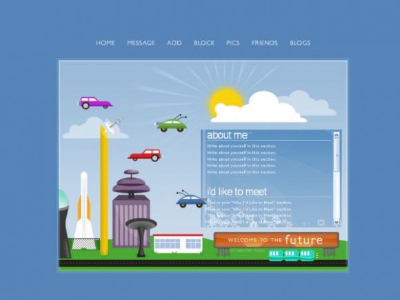
LOL the purple and red cars look like hot rods and the green and blue looks like spaceships. Good job though.

this is amazing!! i loove it! i would use it but i have no idea on how to use DIV layouts

I love the layout.
but im having a few problems.
it wont let my friends comment,message me, see my pics, etc. can you please help?
This is seriously the BEST layout i have ever seen. but I just cannot get the background picture to show up. can anyone help me?


Thanks to both of you. :]
I'll keep your guys' comments in mind.

Cute, clean, sweet.
I think the images on the bottom of the background in the box makes it a bit hard to read the words in the box and your credits also look a bit weird in the box. Other than that, amazing
Haha, I like the funkytown look of this layout though the block colours aren't my favourite and this personally, isn't my favourite of your layouts. Still, quality is quality and when have you ever failed to deliver?
Everybody's getting so creative with the rollovers! Yours defo look chic without being OTT. I like the containment of the content area; often with square layouts there is a risk of the content boxes being too blocky, but because of your execution of this idea, it works really well.
Good job.
Add Comment
You must be logged in to comment
Layout Details
| Designer |
markmejia
|
| Submitted on | Jul 28, 2007 |
| Page views | 40626 |
| Favorites | 301 |
| Comments | 30 |
| Reviewer |
moorepocket
|
| Approved on | Jul 28, 2007 |