Designer's Comments
Look carefully for specific instructions
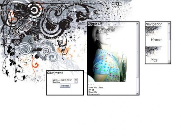
and BLAH with your About Me
Hope you like it
The aim was for it to be a simple and clean layout =]
Using This Layout
For specific instructions read designer's comments
- This is a div overlay layout, html knowledge required!
- 1. Log into myspace.com
- 2. Click on Edit Profile (Profile 1.0)
- 3. Copy (ctrl c) and paste (ctrl v) code to the specified fields
Layout Comments
Showing latest 10 of 16 comments

well i for one thought it was lovely. dont listen to those people. i bet half of them dont even make layouts.
its amazing

Wow, guys don`t hate appreciate. this layout aint done for you to criticize!
if you dont like it i think its better to keep your comments to urself because that ent nice.

looks nice zoomed out, but when you see the preview you can see that the BG pic is small, so it stretches out and looks like shite. sorreh o__o;;

amazing preview.

honestly this layout isn't anything special. You could find it on any of the millions of myspace layout profiles :/

Pretty:)

its really pixelated
and grayish tones
and the boxes shouldnt be transparents
and the shape of the boxes together is odd
its a good and creatie idea though.
sorry if i come off mean.

This really reminds me of the lanterns layout Rachel did once, but I have to say she did it a lot better.
I know you've said you were going for the pixelated blurry look, but I have to ask why? What does that bring to the layout?

oh man
the titles are italicted.
dude. yuck.

To everyone who is say its pixelated...its the way I wanted it...and I hope you all see that
Layout Details
| Designer |
xxjess-91xx
|
| Submitted on | Jul 28, 2007 |
| Page views | 76,518 |
| Favorites | 310 |
| Comments | 16 |
| Reviewer |
karmakiller
|
| Approved on | Jul 28, 2007 |