Summer Bliss (comments)
Displaying 1 - 14 of 14 comments


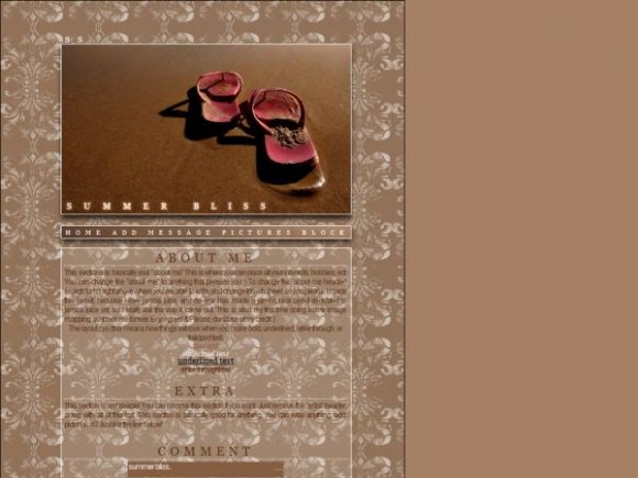
beautiful, i love the picture, but it is kind of awkward how the adds are still on there and the image is covering half of it up, which isn't shown on the print screen image you did of it on here.
the background with the image is so different with the picture which makes it unique and odd at the same time. It is amazing how you made those two things work together and look like they should be together.
amazing and GREAT color scheme


this looks really cool i love it. i dont see how the comment box text relates to the layout though but i do love it :)


ur great. the lyt is great. im great cuz ur great and ur lyt's great. good job =]

u knoe... um the comment box for this layout doesnt work.
is there sumthing on it that is wrong please check and let meh knoe.
thanks.
-ladee-

I really like this. The pattern looks great, though I think you should've made it as the background for the whole page. The nav looks cool, too. I also like the lower-opacity white fill behind the content area, but I think the text would be easier to read if it was just a little bit more opaque.

i'd like it better if it was centered, but i'm a center everything type of guy. it looks really good though. very nice work :)
Add Comment
You must be logged in to comment
Layout Details
| Designer |
IBangBaby
|
| Submitted on | Jul 24, 2007 |
| Page views | 29080 |
| Favorites | 157 |
| Comments | 14 |
| Reviewer |
digitalfragrance
|
| Approved on | Jul 24, 2007 |