Corona Extra (comments)
Displaying 21 - 29 of 29 comments

ii like it.
mostly because ii used to drink it
(ii just find the taste yucky now)

super cool,... but beer is pretty nasty, lol
anyway it would of looked cool if it centered and i agree with mark on the link gap
some rollovers would look cool too
but the brushes and colors are pretty awesome


i like this, but im not going 2 use it cuz i dont want 2 advocate drinking lol

I love this layout! Great job. Screw the nit pickers below!

this looks really nice and simple. i like it. lol i agree with themarkster though. the gap really annoys me i cant look at it for too long but i guess thats just my ocd kickin' in. nice work :)

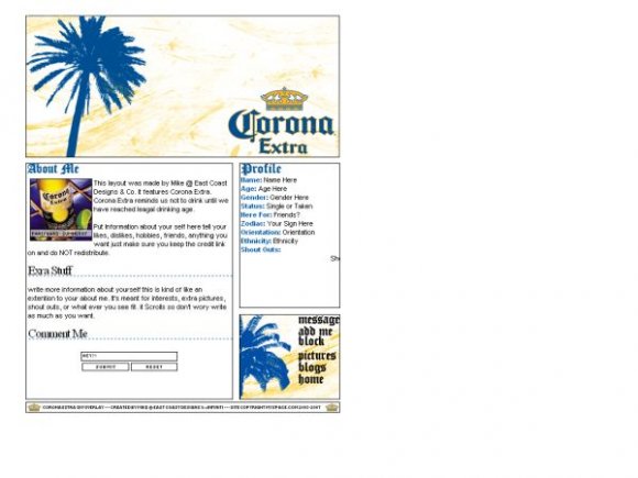
I think the banner looks pretty off and a bit too simple. The texture on it doesn't match all that well with the solid blue palm tree. I know I'm a perfectionist and all (lmao), but the gap between the "Block" and "Pictures" link bugs me, as well as other uneven gaps. But I'm glad your box borders don't look all thick and messy. :]

The minute I saw the layout I was like : this was by Mike. I really like this one. The colors totally match. Really cool!
Add Comment
You must be logged in to comment
Layout Details
| Designer |
IVIike
|
| Submitted on | Jul 23, 2007 |
| Page views | 28166 |
| Favorites | 84 |
| Comments | 29 |
| Reviewer |
karmakiller
|
| Approved on | Jul 24, 2007 |