swing life away (comments)
Displaying 1 - 20 of 22 comments

the music player shows at the top
and its kinda misaligned so that i can see my status and name at the top. any way to fix this?
i really love this layout though :]

XD.....awesome....the background is too white though X.x...black is better XD


i'm still trying to use it..i can't get the info to go in right without screwing everything up..any tips would be fabulous!!!
:]
lol man was i stupid i forgot to put id in all of it great job by the way
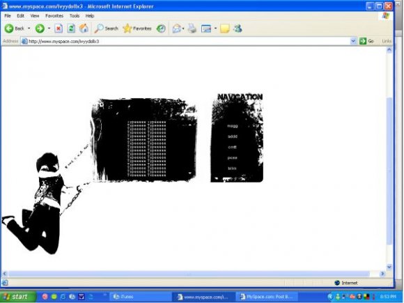
anybody else navigation got screwed up? i freakin love this layout tho

whats a friend id. sry that might be a stupid ? but i cant figure it out.

you have to put it in the areas where it says to put everything, and you cant have ANY codes in there before. (:
i want this layout SO bad but its not working on my profile..is it the html? what is that?
I want one witha boy on a swing lol!!
Anyways.. ^^ err.. yeah I agree taht Navigation should not be put in that area!!


i think it would look nicer if there were lyrics of the song or something, cause otherwise it's just a girl on a swing. :)
it really is a nice layout though :)


i like the image and all but i agree with markster on the location of the "navigation" title

Nice idea. The layout, however, looks a bit too simple. I also don't find it appealing where the word "Navigation" is placed.

simple but the image effect is a tad weird
outside of that it's message is pretty nice
Add Comment
You must be logged in to comment
Layout Details
| Designer |
Demiharlequin
|
| Submitted on | Jul 22, 2007 |
| Page views | 34052 |
| Favorites | 187 |
| Comments | 22 |
| Reviewer |
digitalfragrance
|
| Approved on | Jul 23, 2007 |