Death Said (comments)
Displaying 41 - 58 of 58 comments


darn.... then it must be the fire fox thing =/ my friend has a laptop with fire fox on it i can try to fine a fix for you if you want ^_^

yep i did put all the ID's in i checked twice and yes the comment box works...
just those buttons don't for some reason..T___T
hmmmm they should all work did you put all your ID's in? and is the comment box working?
um..only 2 buttons are working the "Add" and "message" it it becuz i'm using firefox? O.o or theres something i'm doing wrong..>.>
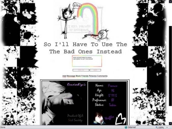
i will say again if you don't think it looks like the screen shot then you misinterpited the screen shot it is exactally the same i pulled it directally from my myspace when i put the screen shot in
and to the person who cant find the URL ^.^ i will put it in the instructions for ya

you repeat the word "the" twice in a row in your main sentence: "so i'll have to use the the bad ones instead". thought you might want to know :/
i can't seem to find the place to put my picture's url in. can u helppppp plzzz????

i agree it looks nothing like the screenshot
the image of the stickfigures looks really blurry
and the brushes on the side look soo out of place.
this really doesn't look good
has u kept it all white things will flow a lot better then what you have now

people it is exactally like the screen shot i took the screen shot of my myspace then pulled the codes directally from my myspace the only thing that is different is it doesn't have my pic thing in it so if you thought it was different then you thought wrong the screen shot is exactally the same

it doesn't look like the screenshot..
i mean, the image thingy seems to only take up about 3/4 of the area.
hmmm well i havn't checked it on fire fox yet i was going to do that when i go to my friends house next, so i don't know bout the buttons but the black with purple text is what i have in that section you can put what ever you want in there that was just an about me i had made in photoshop cause i am currentally using this layout

it doesn't look like the screen shot to me, i don't see any of that black with purple text, and only two of the navigation buttons work, message and add, the rest arent for me
i'm on firefox

It's cute but.. I don't get it.
Lol.
It's probably something really obvious that I'm completely missing.
I like it a lot.
Add Comment
You must be logged in to comment
Layout Details
| Designer |
ConceivedCynic
|
| Submitted on | Jul 18, 2007 |
| Page views | 122582 |
| Favorites | 722 |
| Comments | 58 |
| Reviewer |
karmakiller
|
| Approved on | Jul 18, 2007 |