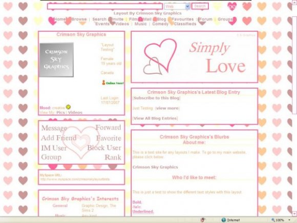
Designer's Comments
Look carefully for specific instructions
Using This Layout
For specific instructions read designer's comments
- 1. Log into myspace.com
- 2. Click on Edit Profile (Profile 1.0)
- 3. Copy (ctrl c) and paste (ctrl v) code to the specified fields
Layout Comments
Showing latest 10 of 10 comments

i love it!

Actually, it's not times new roman. >.> It's one I downloaded from dafont.com. When you compare them they are different.

The banner looks extremely plain, not to mention the font that was used was Times New Roman. The contact table looks really plain too, and also uses the Times font. Times New Roman isn't a bad font at all, by the way, you just didn't use it right.

very cute, just the background image doesn't work for me @_@ but even without it I like it :D
quccci: I thought the plain banner looked better with such a busy background, but I know what you mean. ^_^
brookly: Strange. o.O It's just uploaded to image shack..and the coding is standard css. Granted, I've never tried any of my layouts in firefox before.
If anyone knows why it's not working in firefox, please PM me so I can change it. :)

i see it in my other browser (safari) but i don't see it in firefox.

the background works for me.
im not too fond about the banner being so boring and plain, but i like the background
Luku: Glad you like it! ^_^
Brooklyneast05: Strange,that's two people who have had that problem..I don't know why. =\ Nothing special about the coding and CB uploaded it to their servers.
i dont know if its just me, but the background wont show up when i look at it

This is cute!
Layout Details
| Designer |
CrimsonSkyGraphics
|
| Submitted on | Jul 17, 2007 |
| Page views | 44,585 |
| Favorites | 191 |
| Comments | 10 |
| Reviewer |
freeflow
|
| Approved on | Jul 17, 2007 |