(London Eye)+new navigation & background (comments)
Displaying 21 - 37 of 37 comments

I think this is really pretty. ;] Screw everyone else.

LOL. I swear, myspace MAKE you read a bsic tutorial on html. I think its a nice layout overall =)

pretty good, but ditto on the links. But people can always get the myspace default links if they go back.


Why is it not a good layout, Raspberrii?
Just because I didn't include the links?
I'm sure you can find them somewhere on the internet, Blagheartedstar. Just type in, in Google/Yahoo/whatever "myspace default links" or something similar, and something should come up.
Also, Blagheartedstar, it's not a pic from deviantart, it's a pic from here (createblog) from someone called gelionie, who I have mentioned in the 'designers comments' section.
Thank you to everyone else, =D.

Cute picture but why didnt you include the links!? This is not a good layout


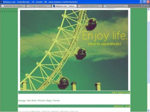
hope its not a pic from deviantart
outside of that the layout looks ok, the comment box is pretty damn huge
and you didn't add any links
not everyone knows how to do that
home, add, message, block, blog, comments, friends


it's not centered in the cb preview thingy.
but im not very fond of the yellow background. it kind of reminds me of barf
but i like the effect of the image


wowthe picture is so pretty and i love the bright colors!! spectacular =)


i like the picture, i've ridden the london eye, its great. good layout, i like the colours and that u didn't go with the whole tiny font trend


Add Comment
You must be logged in to comment
Layout Details
| Designer |
PaintMyFace
|
| Submitted on | Jul 17, 2007 |
| Page views | 52195 |
| Favorites | 359 |
| Comments | 37 |
| Reviewer |
mzkandi
|
| Approved on | Jul 17, 2007 |