3-colored-tabled-div (comments)
Displaying 1 - 20 of 28 comments

I like the layout but, theres something awkward about it,could be my browser/screen/etc. though. =)
WTF? O.o Great layout and all, but id doesn't work. .-.
Well when i tried it, the word pictures and videos showed up and that was it. No page no color nothing. Wat did i do wrong?
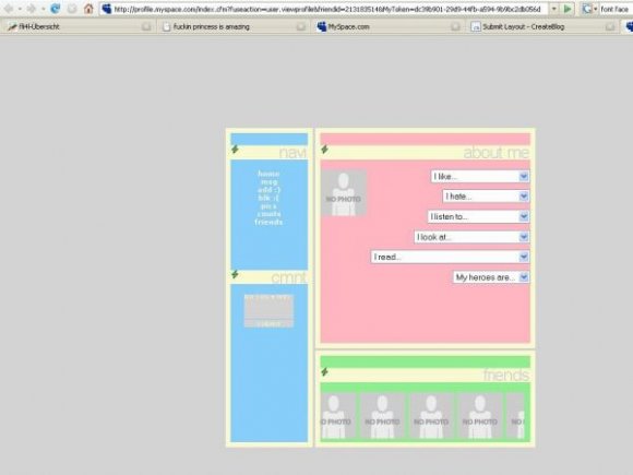
How do I put words in that one thing, i like... and you select one... How do you put the words in there? I don't know how, please help :]

stop this arguing every one likes different things! But I am annoyed with Anz-Lytz the desighner This layout does not work at all! the scroaling friends bar moved into the very bottom of the about me section so it lookes stupid then the next day my, myspace page had turned compleatly grey with to small words in the middle saying pics and home. I also think the desighner should make changes for people so it makes it slighty different from other peoples and it would be just how they like it!

i really like this layout and will be useing it thank you very much!

The reason the scrollbar on the friends is appearing for some people is because they are using Internet Explorer. I suggest you all switch to Firefox. ;)
The downside to that, though, is that the way you coded your dropdowns, Miss Anz, doesn't show on Firefox. I noticed you had your Options set so that they have a transparent background. That only shows on IE.
Also, the lighting bolts would be better if they didn't blink, and matched the colours of the layout more, which is simple to fix with an image editor. :)
I do like the layout though, overall.
I LIKE THE GREY BACKGROUND AND THE LIGHTENING BOLTS ... IF YOU DONT LIKE IT ... KEEP YOUR OPPINION TO YOURSELF . BECAUSE I THINK THAT YOUR COMMENT IS UNNECESSARY ...
COULD SOMEONE PLEASE HELP ME ... WHEN I PUT THE FRIEND ID CODE IN .. IT DOESNT LET YOU SEE MY PICTURES ... AND IT KEEPS THE PICTURE BOX BLANK ... HOW DO I MAKE THIS WORK? ... ALSO WITH MY FRIENDS NAMES/PICTURES ... THEY WONT WORK ... PLEASE HELP
I think it's adorable!
I needed a layout, and now i'm using it! :) it's cute and the bolts are a nice touch. I don't se why all these people hate them...
and if you don't like them, then don't use it. end of story. =/

@TaylorGeorgina: thanks for your "telling-off" at the other ^^
i just amend sth at "designer's cmnt" at the end, so please read.
I LIKE THE GREY BACKGROUND AND THE LIGHTENING BOLTS ... IF YOU DONT LIKE IT ... KEEP YOUR OPPINION TO YOURSELF . BECAUSE I THINK THAT YOUR COMMENT IS UNNECESSARY ...
COULD SOMEONE PLEASE HELP ME ... WHEN I PUT THE FRIEND ID CODE IN .. IT DOESNT LET YOU SEE MY PICTURES ... AND IT KEEPS THE PICTURE BOX BLANK ... HOW DO I MAKE THIS WORK? ... ALSO WITH MY FRIENDS NAMES/PICTURES ... THEY WONT WORK ... PLEASE HELP

The blinking lightning icon looks very random and unnecessary. Also, I personally think you should add some padding within each content box to make the content appear more neat. Lastly, the gray background, in my opinion, completely messes up the light colors of the layout.
Beneath "using a layout" is still standing how you have to use the background!
if you don't have enough html knowledge for exapmle to complete the drop-downs etc than you should search for a normal my space layout -.-
this is really complicateing how do I put this on my own myspace layout?
Add Comment
You must be logged in to comment
Layout Details
| Designer |
Anz-Lytz
|
| Submitted on | Jul 17, 2007 |
| Page views | 70410 |
| Favorites | 413 |
| Comments | 28 |
| Reviewer |
brownsugar
|
| Approved on | Jul 17, 2007 |