Silly Hearts (comments)
Displaying 1 - 16 of 16 comments

i really like this layout but it makes my playlist and videos....messed up in corner..is there any way you could help me fix that...othere than that it's SOOOO FRICKIN' CUTE!

i love this layout it really is gorgeous...like seriously..but wheres the contact table...does it not work or somthing???
where is the Contact Box thingy? there isn't one soooo ..
this layout is really cute.. and im using it right now.. but the comment box doesnt work.. is there any way to fix it?

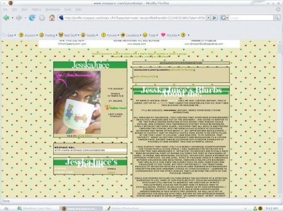
This kind of reminds me of someone else's style of coding... Riotstar's I think. The background is really cute though and the colors are nice and the headers are a tad bit too big...


weird that the font for the name is much different than the one for the rest of the layout
and it sucks for the person who had like 15 letters in their name... it would look messy like it does in the live preview
i dissagree... i think the letters being that big puts more of a creative design to it...
i do love the color scheme also! its very adorable! great job! very cute

Yeah. I agree. But, it looks like in the screen shot, the headers look like geogia or times? In the actual preview, the fonts are either arial or tahoma? =/

i agree with the large font.. too big..
but it's okay.. people could always change it right?
other than that.. it's all good!
really cute!

I like it but the letters of the headers are WAY too big... :/

i think the heading font is a little big, but otherwise its good

Add Comment
You must be logged in to comment
Layout Details
| Designer |
JesskaJuice
|
| Submitted on | Jul 14, 2007 |
| Page views | 76945 |
| Favorites | 216 |
| Comments | 16 |
| Reviewer |
mzkandi
|
| Approved on | Jul 14, 2007 |