Summer 07 Scrapbook (LMDS) (comments)
Displaying 1 - 14 of 14 comments

do you think that you can make one thats like that but summer of 09? please

ur good dsigner but u make the backs too huge dude- tone it down, people hate to scroll around to read

is there some way to resize the image?
it's just too big on my screen..
but other than that,
AMAZING LAYOUT!


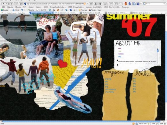
layouts need a block button and i'm not too happy with that huge blue banner although it covers the ad here on CB i don't think it will hide the one on myspace. that blue on the very top of the layout looks soo out of place when you have a black pattern for the layouts's background.
the 'scrap book' feel isn't really here for this layout and usually scrap books have patterns... a variety of different patterns on one page and scrap books although they look random they have order... this doesn't seem to have any. i'm not saying you should stop making layouts.... just this isn't your best.

and the BANNER! people get deleted for covering the BANNER, so i recommend you remove that blu thing.....
or you're gonna get people who use this layout deleted.....
not tryin to be annoyin just helpin you

I don't know if it's just my monitor but it seems like there is a lot of scrolling in the black space at the bottom.

I like it. Its really creative =) But, you should remove the blue banner. Its covering the ad.

I don't know what you guys are talking about, I like the blue banner at the top, whether it's supposed to be there or not. But I agree, if you'd gived the pictures a bit more edge instead of rounded off when you cut them it would look even better.

cool ideas
i also don't like the blue thing at the top, but maybe thats just my browser?


im obsessed with it.
but i dont like how there is that bluet hing at the top, when there isn't one viewed in the preview.
i also think that if you gave the picture more edge when cutting them, it would've looked alot better.
but im still in love with it
Add Comment
You must be logged in to comment