Blink-182 (comments)
Displaying 1 - 11 of 11 comments

gay. it needs to be darker, different colors, and the big box is unnessacary
Posted by xJaKexSyNx on Mar 20, 09 12:43 pm


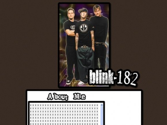
Its pretty plain. I think the image would have looked alot better if you hadn't made that effect. And I agree with alvin, that big white spot above the navigation is troublesome =/
Posted by IBangBaby on Jul 13, 07 9:19 pm


I think the "banner" would have been better on the side instead of the top since it is so slim.
Posted by luku on Jul 13, 07 2:17 pm

The image is cool but then it's like BAM a big white box... so un-creative... :(
Posted by FoxLucky on Jul 13, 07 1:02 pm

i agree with SChizo below,
and the thing now is doing band layouts, thats cool
Posted by elrene06 on Jul 13, 07 11:24 am


The layout's nice. But I don't like the purple-ish orange effect of the image, the one behind the band.
Posted by shortcake on Jul 13, 07 1:08 am

Page 1 of 1
Add Comment
You must be logged in to comment
Layout Details
| Designer |
yesnt
|
| Submitted on | Jul 12, 2007 |
| Page views | 13271 |
| Favorites | 28 |
| Comments | 11 |
| Reviewer |
moorepocket
|
| Approved on | Jul 13, 2007 |