Designer's Comments
Look carefully for specific instructions
Please don't remove the credit link :3.
Using This Layout
For specific instructions read designer's comments
- 1. Log into myspace.com
- 2. Click on Edit Profile (Profile 1.0)
- 3. Copy (ctrl c) and paste (ctrl v) code to the specified fields
Layout Comments
Showing latest 10 of 11 comments

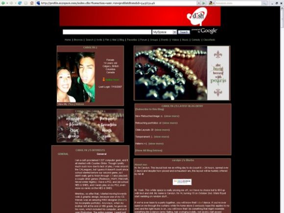
okay did no one catch the fact that its grammaticly incorrect? its she "hanged" herself with pearls. not hung. you use hanged with youre talking about a person hanging themselves, you use hung when youre talking about hanging laundry or something.
"she hung herself with pearls" basicly just means she drapped pearls all over herself....
sorry it just bugs me. if you dont belive me look it up.
I like this layout a lot; the extended network banner is really pretty but personally, I think i would've looked okay without the text......
you could of gone with a more vintage looking background for this layout..

I like this. It's really pretty.

I loveee this layout even the graphic * pearls*, it's completely beautiful. I'm currently using it as my own layout, it fits my name.. brown colourd doll lol

pretty creative way to get the message on the extended network
the black bg looks nice it puts more focus on the images of the layout

I don't like the little box thing in the banner that has the text.
I like the colors and the photo though.

i agree, i dont really like the background.
if you were supposed to be creating the elegant effect, the text and black background totally put it off that topic.

i don't like home there's a box around the text. it's a well good layout though. [:
It's absolutely stunning, love. Great function.
~~Xx