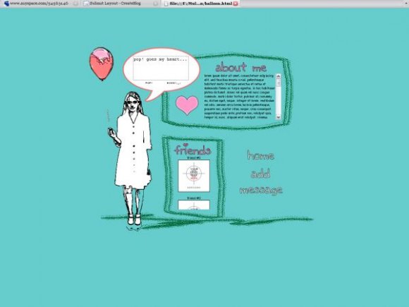
pop! goes my heart (comments)
Displaying 1 - 20 of 25 comments


Really nice layout!!
shouldnt the background colour code be #5BC6C6 ? x
there's a link to home,add and message but none for pictures? Am i missing soemthing?
Okay...erm...first, ahhnuhh, copy the code, and paste it into Notepad, or some other similar text editor. I find it easier to read/edit code in fullscreen mode rather than a little form box.
Once there, look for "div class='navigation'". Within that div, there should be two "########," and replace those with your Friend ID. Right under that navigation div is the div for comments. There's only one "########" in it.
That should be all you touch, unless you want to edit your friends, but until you get real comfortable with being able to recognize code, I'd put that off for later.
If you're only touching what you're supposed to, there should be no problem, unless you're getting the wrong FriendID. Some tutorials tell you to go to "Home," and your Friend ID should be at the end of that, but for me, it doesn't show up sometimes, so what I do is go to my page (with everything cleared, or copied to another blank Notepad, so you have the original MySpace layout) right click any function on the contact table (except for IM/Chat) and click either "Copy link location" or "Properties," depending on which browser you have. Once you have the address copied, paste it into Notepad again, and look for the last eight digits after it says Friend ID.
Sorry if it's a little confusing, but I hoped that helped. Please tell me if it's still not working :x.
this certain layout is really nice. somehow, I think I'm doing something wrong with the friend id thing. people can't add comments/message me. HELP? please&thankyou
reminds me of that film music and lyrics cause hugh grant sings a line pop goes my heart


Really cute. The color to layout doesn"t match the color to the background but I still love the layout.
Like I stated, this is because of an inconsistency in the IE browser. I'm trying to find an alternate color that IE users can use instead, but otherwise...er...switch over to Firefox :x?
Extremely creative layout, my sis would love it:]]]]
If only the backgrounds matched up....

Yeah this would be really nice if the backgrounds matched...

great :)
but on my computer, the image doesn't match the background.
it's just weird


i like everything about the overlay except for the image...it creeps me out. ur credit is awesome!!!


The image is kind of weird although I like how you made the boxes look like they were drawn out of crayon. The rollovers are cool too.

Add Comment
You must be logged in to comment