Designer's Comments
Look carefully for specific instructions
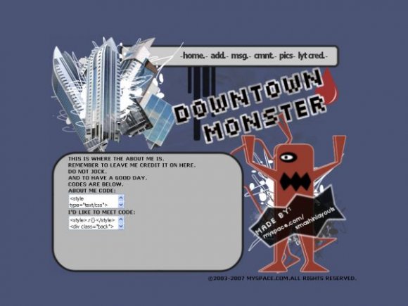
Ok guys. This layout took me some time.
Yes, I made the monster and found some buildings to make a mini collage. Feedback would be nice
Remember to leave my credit on.
I will hunt you down if you dont.
And to replace FRIENDIDHERE!!! with your friendid
Yes, I made the monster and found some buildings to make a mini collage. Feedback would be nice
Remember to leave my credit on.
I will hunt you down if you dont.
And to replace FRIENDIDHERE!!! with your friendid
Using This Layout
For specific instructions read designer's comments
- This is a div overlay layout, html knowledge required!
- 1. Log into myspace.com
- 2. Click on Edit Profile (Profile 1.0)
- 3. Copy (ctrl c) and paste (ctrl v) code to the specified fields
Layout Comments
Showing latest 6 of 6 comments

cool u should try making a dexter's labatroy's div
By jeuru on Aug 10, 2007 1:40 am

This layout is wicked cool. But the credit thing makes it look cheesy. Could you make it a bit smaller?
By DMS13 on Jul 24, 2007 9:37 pm

I liek the rounded content box. The layout looks pretty good.
By YourSuperior on Jul 11, 2007 3:26 am

i like the buildings too but the monster does look blurry...i like it tho =]
By jesusisthebestthing on Jul 10, 2007 11:26 pm

I really like the buildings, although, the image for the monster is really blurry, and the font seems to be blurry as well. The credit is also a bit big.
By IBangBaby on Jul 10, 2007 6:54 pm

not centered and the double credits is a tad weird
anyway i love the buildings but not to fond of the font for Downtown Monster
By Blaqheartedstar on Jul 10, 2007 6:52 pm