mag (comments)
Displaying 1 - 12 of 12 comments

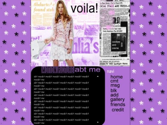
Could use more font faces. Use more brushes and such. Needs work.


the graphic/quality is horrible,
the texts dont match at all,
and neither does the background..

thanks for the honest comments
ill be sure to make it gif, or png
didnt noe that jpegs werent good
:]

The quality of the entire DIV overlay is not that great. The fonts could have been better too, especially for the images and navigation. It just seems like you just slapped a bunch of stuff together. Not to sound so blunt, but that's the way my opinion came out.

The graphic really makes no sense to me at least and the picture quality and font look really bad.
I like the colors and the background, I just think the body could have been done better.

the image looks squished and you could've used a different font for the "viola"

not to mention the load time is cut in half on .pngs & .gifs -- less "pixelated" or "blotchy"


The navigation links and the "abt me" look really pixelated. And riostar is right, jpeg images lose quality faster within every edit, rather than gifs and pngs.
i like the organization & the colors. the graphic however you should have converted it to either .gi or .png. JPEGs aren't very good for clarity on graphics. good job all in all.
Add Comment
You must be logged in to comment
Layout Details
| Designer |
cookiescreme
|
| Submitted on | Jul 6, 2007 |
| Page views | 13450 |
| Favorites | 25 |
| Comments | 12 |
| Reviewer |
mzkandi
|
| Approved on | Jul 6, 2007 |