Ipod (comments)
Displaying 21 - 40 of 45 comments

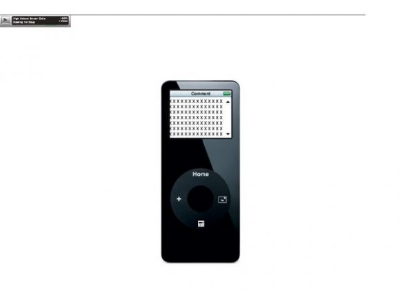
i tried to make one of these...but using the ipod video...but the only problem i had was getting the nav buttons on the wheel...but it wasnt in div...table back ground as the ipod then a scroll box on the screen
so i thought i would wait till someone made one for me lol and you have (Y)
nice job...however ipod video would be better :)


very cute, but i think it might have been better if the music player had been put into the ipod somehow. I don't know. Circle nav is a great idea, I like it overall.

I like it, I think it is small and theres not much room for content and stuff, but its simple.

it's awesome!
you should make more like that like PSP, a laptop, a computer and a television!! that would be awesome! i'll use one of these if you make them
great job mate


I agree with falsetigerlimbs. An iPhone would be creative if you made it right about now. :D

I think you should have made this an iPhone, not just an iPod.
;)
This still looks pretty cool though

The navs and stuff are nice, but there isn't a lot of content space. It would also be cool if you could somehow integrate the music player right into the iPod.

The iPod looks great, and the content box fits in well. The circle nav looks creative, too. But the fuzziness of the image makes the overall quality of the layout look bad .. unless it's cB's image hosting's doing.

Well, I cannot comment on the artistic wrongs or rights, as I'm not an artist/designer..
I would like to say, though, that it's pretty awesome! Better than anything I could even attempt to partake in.. =)

I like it, and the glossy highlight-ish look on the ipod,
ehehe if you added another glossy look on the round part; it would look more realistic (:
Overall; good job!


Not bad. I like it, but the box is very small. Don't think I'd use it for that reason. Otherwise creative and a cool concept. ^_^

cool layout. Would've been better with better quality pics though and I would've tried to add maybe more visual stuff in it.

This is cute. I alwyas wanted to do something like this :) But the image quality of the ipod is a little low, and it covers the ad =(
the icons on the scrool wheel arent to helpful to the average user but other than that, it pretty awesome.
Add Comment
You must be logged in to comment