Ipod (comments)
Displaying 1 - 20 of 45 comments


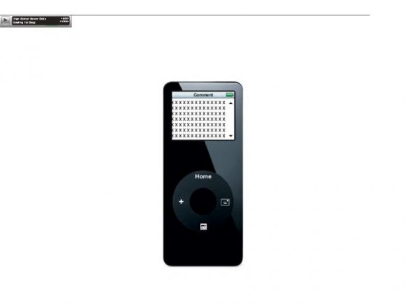
Uhh..it's missing a "block" link (which is REQIURED) and the image is kind of blurry and in low quality but other than that, it's pretty cool.


the best minimalist layout ive seen in a while.
its simple and fucking awesome.
ill be using this for a while.

nice work.
but the NAVI is a bit confusinf for my friends :}


This is probably the best layout I've seen anywhere on the internet.
But...
I want to put the iPod on a section on my page. That would be radly insane. So if you could do that I'd love you long, long time.
lol! thats so cool!
u could make it with diff colors of minis too.

i tried putting this on my myspace,
and i follow pretty everything you said to do
and when i view my profile,
its all white
with the song at the top left corner playing,
whatt did i do wrong?
help?:)
eva gonna make diff colors??if u eva make blue...IM TOTALLY GONNA USE IT~
Ooh I love this! Simple but realllllllyyyyy effective. I'm using it on my myspace just now. (:

It's alright I guess, I just wish you would've used a much better quality picture.

I NEED HELP!
It worked for about 2 hours,
then when I went to it again. the page is all white, you can see the myspace add at the top and all else you can see is the song. I don't know what happened. any suggestions?
Omigosh I love this. I like my pages simple and to the point and this does just that. And now my stalkers cant look through my friends and comments unless they are using a greasemonkey script (which I highly doubt). Its so cute. I could blab forever but i think i'll stop here. Thanks!!

it's amazing.
thought the blog box thingy is quite small, it'll do.

this div is really cool! only thing that confused me was how it says COMMENT above where you write your about me. I thought thats where you wrote the comment ;]
Add Comment
You must be logged in to comment