Hump a Stump (comments)
Displaying 21 - 32 of 32 comments


Dont worry! Its cb. Alot of the layouts are taking extremely long to load right now. I cant even load some layout previews.

I really like it, except that Hump a stump sounds sus!!Also, it takes too effing long to download! I had to refresh 3 times to make it all come.
Is it a PNG?


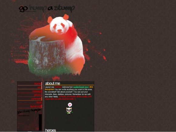
The overall thing is pretty cute a long with the saying. The cutting is a little shaky (but I shouldn't say anything because I am a terrible cutter) but otherwise not bad. :)

Everyone, Thanks for your opions! I changed the home font ^^

cute, but a member already has the whole slang credit link thing going on
as for the pic, pretty cute and the font goes well, just you nav seems to be weird, the images on hover are pretty cute and creative, just the style of font looks to bee off
why is the home link bold when the others arent?
other than that the rest looks great

I kinda like the graffiti font you used for the title, and the credit in pixel font under it actually makes that part look neater. The header looks really weird or random to me. And again, the letter spacing on the nav font really looks off, but that's just me. x]

Add Comment
You must be logged in to comment