Designer's Comments
Look carefully for specific instructions
i hope you enjoy the layout
Using This Layout
For specific instructions read designer's comments
- 1. Log into myspace.com
- 2. Click on Edit Profile (Profile 1.0)
- 3. Copy (ctrl c) and paste (ctrl v) code to the specified fields
Layout Comments
Showing latest 8 of 8 comments

really light i would have darkened it up a bit
By IVIike on Sep 16, 2007 5:52 pm

Ooh, how very much like ice cream!
By ecky on Jun 26, 2007 8:18 pm

this layout is really plain and washed out, and the words are very choppy, if that is even the right word for it..
By Peanups on Jun 21, 2007 1:31 pm

I like the style. The only thing is that the colors look far too washed out together, kind of hard to read. :(
By FoxLucky on Jun 20, 2007 11:28 pm

You could have made the content bg a different color to make the fonts and text easier to read. Also, the headers appear to be pixelated.
By IBangBaby on Jun 20, 2007 9:03 pm

Way too simple for my taste. I'm not even fond of the style, either. Sorry. :[
By markmejia on Jun 20, 2007 4:16 am

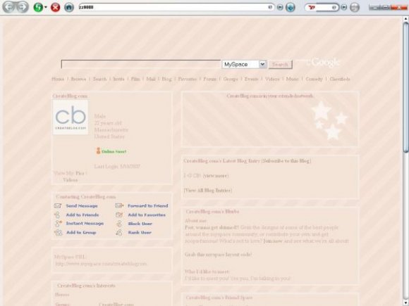
whats up with the screenshot?
By speakerboxx123 on Jun 19, 2007 7:09 pm

Too plain for me =[
By schizo on Jun 19, 2007 1:27 pm