Designer's Comments
Look carefully for specific instructions
Using This Layout
For specific instructions read designer's comments
- This is a div overlay layout, html knowledge required!
- 1. Log into myspace.com
- 2. Click on Edit Profile (Profile 1.0)
- 3. Copy (ctrl c) and paste (ctrl v) code to the specified fields
Layout Comments
Showing latest 7 of 7 comments

can some one make me a claire lay out ;-;

Where R The XXXXX's At? I Can't Find Them

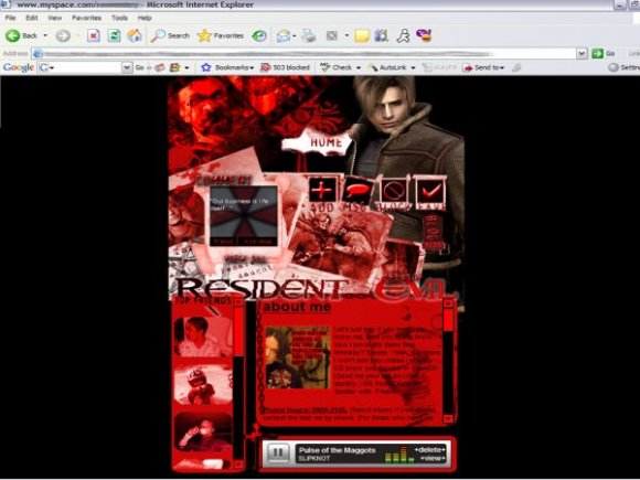
there's a little too much red IMO
i'm an avid re player, so this is my dream layout. i freakin' love it. but, i'm kind of a freak when it comes to spelling, and i know that we can change it, but 'general' is misspelled on the homepage. i just know that some people that aren't that great with html wouldn't be able to find it in the codes. but i do love this layout!

Oh I love how this is done! Very nice!! The images look great and the text looks amazing with this layout. :)

I think the red is overdone. The header image looks a little too crowded, and I don't think the scrollbars for the sidebar and content area suit it well. Also, I have to agree with Bishinobi. The navigation is just a little hard to see. You could've emphasized the nav buttons more by placing it on the side or something. I'm not sure if it was your intention, but next time, try experimenting with different color combinations. :]
This is a very elaborate layout and I can tell you put alot of effort into it, but its pretty complicated and could easily confuse someone. But love its morbidness(is that a word?) and structure. Great Job!
Layout Details
| Designer |
revengelover
|
| Submitted on | Jun 18, 2007 |
| Page views | 18,864 |
| Favorites | 49 |
| Comments | 7 |
| Reviewer |
alovesopure
|
| Approved on | Jun 19, 2007 |