Fall Out Boy DIV (comments)
Displaying 1 - 20 of 20 comments

Oh I love the bright colors against the black like that.

This is amazeee :]
When I was like a huge fan of FOB I so would have used this, LOL :D
x

this looks awesomeee. better late than never with this comments. :]

still like the layout,
but is there anyway to hide the comments?
o wow
this layout is AMAZING
i like it a lot!!!!
do u take requests??
like....maybe a paramore layout...?
that would be REALLY awesome

hey i'm using this layout right now but the comments are messed up. but i tried putting in a code to hide the comments but then part of the page wouldn't load.
i'll try and look for a different code to hide the comments and i'll get back to you.

nvm bout the lyrics, i always thought it was something diff.
i rlly love this layout!
the only bad thing about it is that the lyrics are wrong.
this layout DOES stick out, i'm seriously debating using it.


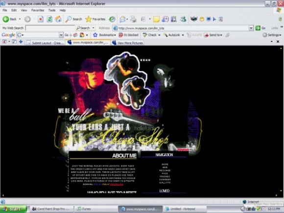
most Fall Out Boy layouts have Pete the main feature, but this one shows each member equally. I don't have anything against Pete but I think every person in a band being shown is crucial. great job! :)

This is good for a first DIV! I would only suggest that you try to make the edges more smoother (rather, anti-aliased), since it looks pixely. Also, try to practice more on your blending. I kinda like the fonts you used for the header, but I think you should try out better colors. :]

... typos big impact*
another band instead of fall out boy*
a bit excessive with the effects on the image header... to make a bit impact try aiming for another band intead of fall out boy, why i say this? well theres a million fall out boy layouts and because theres so many a new layout with the band doesn't stand out regardless of how good it is
it just becomes another fall out boy layout
u have potential to get better try aiming for themes no ones hit yet
Wow, I love it - the colours... on the navigation are so cool! =D
Agreed. This is excellent, regardless of whether or not this was your first. Love it.

This is really cool.
And it's your first div so that makes it even better.
I'm not a fall out boy fan,
But the layout is still good.
Nice job =]
Add Comment
You must be logged in to comment